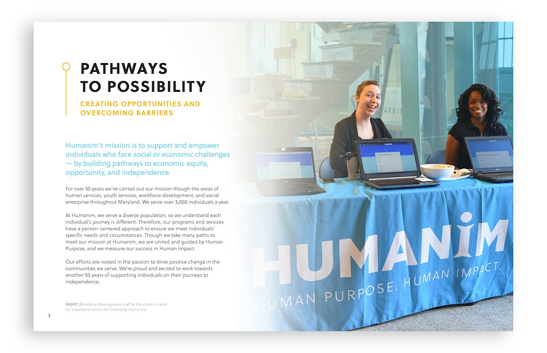
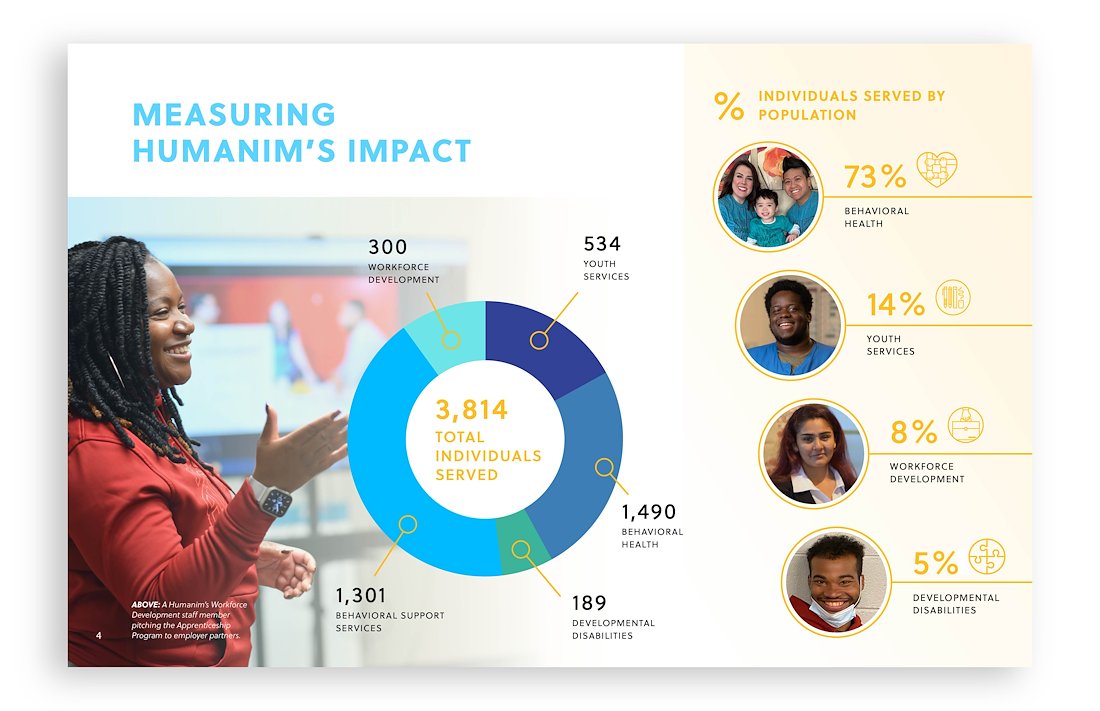
Using Humanim’s main colors (white, blue, black and yellow), I came up with a design inspired by sunlight and fresh air to evoke an inspiring feeling ripe with possibilities. The circle motif serves multiple purposes – it provides an organic texture, it symbolizes data points, and it “connects the dots” of the nonprofit's impact. The gradient background behind photos of staff members and program participants highlights each individual’s warmth and humanity, conveying the person-centered treatment that drives Humanim's programs.
The report is currently being finalized as a screen-reader accessible PDF to be viewed on their website.